Thursday, November 10, 2011

Kitchen Seating: our hunt for the perfect banquette

Our slumbering cat on the banquette
During the many years we spent planning our kitchen renovation we would often refer to something we called our future dining sofa. We would say, "It will be so wonderful to sit here when we have our dining sofa!"  To our aging cat who loves to lie on the floor between our chairs at mealtimes, risking accidental kicks and all of the dangers of being underfoot just be be nearby, we would say, "When we have our dining sofa, you'll lie right up here between us and save yourself the cumulative effects of being trodden upon daily," or words to that effect.

All this time, we didn't really know what form this dining sofa would take, or whether such a thing specifically existed.  We'd certainly seen sofas pulled up to dining tables, imparting an air of luxury and cosiness to the scene, but we wondered about getting the proportions and firmness just right for the quotidian task of dining.  After all, this was to be our daily perch for all our meals, and not mere set dressing.

When we began searching in earnest for the dining sofa of our dreams, we discovered that our terms weren't quite right.  What we actually wanted, apparently, was not a sofa, but a banquette.  Banquette to me had always conjured an image of something built-in and quite often badly built--like something cobbled together out of plywood in a new chef start-up restaurant. You know the kind of thing: the back and seat meet at right angles, the seat is far too short for comfort and upholstered with meager cushions that do nothing to save your spine from the jolt when you sit, and the base, also constructed at right angles, leaves no room for your heels, so you wind up kicking it every time you move.   Of course we'd also sunk our tired bodies into beautifully upholstered, plush restaurant booths, with properly sprung seats and everything at the ergonomically correct angle. Could both extremes be called banquettes?  We'd need to define our version.

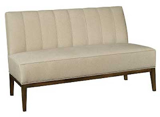
We decided we wanted a piece of  furniture that could be moved from the end of the table to the side--depending on the table orientation and how many were dining.  We wanted a sprung seat, bare legs, durable upholstery that could take a beating, no arms to impede access from the sides, and simple elegant enduring design that would perfectly complement our new kitchen.  Eventually...we found it, the perfect thing: Hickory Chair's Bistro Banquette.


The Bistro Banquette by Mariette Himes Gomez for Hickory chair
Hickory Chair allows you to customize your banquette right down to the size and finish of the upholstery tacks.  We chose a smooth black leather, and dark stain for the legs, very much like the chair version shown below.
The Bistro Chair by Mariette Himes Gomez for Hickory chair
We'd found it, but we also found we couldn't have it for about 12 weeks.  Since the kitchen renovation had taken so many years to come to fruition, we decided several months for the perfect banquette/dining sofa was not too long to wait.

And now, the wait is over: 

Here it is in situ with a lambskin over the seat (luxurious cat claw protection)
When the banquette arrived, it made our much abused Duncan Phyfe dining table (purchased very cheaply via an ad in the Pennysaver, long before the days of Craigslist or Kijiji) look very shabby and out of place with it's medium brown scratched finish.  But the table dimensions were so perfect for our space that we decided to refinish rather than replace it.  I scraped all the peeling veneer from the edge of the table with a razor, sanded the top and the curvy tripod legs, and stained it all with a dark Minwax oil based stain that I mixed to match the legs of the sleek new banquette--so dark that the missing edge veneer is not at all apparent. We we surprised by the effectiveness of the transformation.  I wish I had a picture of its state prior to refinishing. 

Another view without lambskin and refinished Duncan Phyfe table
We now think that the two pieces live quite happily together in the space.  The table gets to stay.  We still need to find chairs.  Right now my wicker-look black resin outdoor IKEA chairs are sitting across from the banquette.  They're quite comfortable, but maybe aren't quite the thing.

Hickory Chair Bistro banquette, Duncan Phyfe table, and IKEA outdoor chairs
But who knows?  It may be sometime before I get around to changing things.

Monday, November 7, 2011

Tile Backsplash Update

Our renovated kitchen has existed in a nearly complete state for several months now, but we're still several details short of proclaiming it fait accompli, so I'm going to post about some of the interim stages before revealing the full thing.

the bar sink corner now grouted
When I left off telling the tale, we were in the process of tiling our backsplash (read about it here).  We did this job ourselves and we're very pleased with the results.  We used now ubiquitous subway tile in an ivory colour, but we think it goes well with our house, which was built in 1889. 
Our looming decision was grout colour.  We wanted one to contrast with the tile enough to show the pattern but not so much as to be distracting. What we really wanted was something like the shadow line cast by the ungrouted tile.  After much debate and vacillation, we chose a slightly cool gray called silver (from the Mapei line of sanded grouts).  Our reasoning was that the cool gray would provide some opposition to the ivory of the tile and prevent the wall looking too warm or muddy.  We think we made a good choice. Looking at it now, the grout is a good match for the shadow line of the inset cupboard door--just what we'd hoped for.

Serendipity was at work for us. The ogee trim tile we had left over from our bathroom renovation was an almost perfect match for the moulding our cabinet maker used for the under cabinet light valance (although we did have to order 8 more pieces from California), and we were able to file down a special little corner piece to finish off the line of ogee tile without having it stand proud of the column.

serendiptious match of ogee tile and light valance moulding

We'd originally thought we would clad over our cement and brick column (read about that epic saga here), but in the end we liked the cement and decided to let it stay and just run the tile all the way up to the ceiling on the other side.  I love how this corner turned out.  Our cabinet maker did a beautiful job of scribing the cabinet to the very uneven wall and, now tiled, the corner looks seamless.

tile to the ceiling at the glass corner cabinet

We decided to forgo any special tile pattern over the range, because we thought it would be largely obscured by the plate rack (our modified IKEA Grundtal rack).  We're thrilled with our hacked IKEA rack.  We're not the first to do this, but really, it couldn't be better.  N cut each stainless steel rod of the disassembled IKEA rack to the correct length (42") with a pipe cutter, popped out the little piece meant to the recive the screw using a dowel and a mallet, and epoxied the little piece back in the newly cut rod ends.  The brackets were mounted in chiseled-out recessed niches in the studs behind the range.  We tiled right over the brackets and now we have the best over range shelf anywhere.  We mounted it high enough for plates to catch the most rays from the heat lamps on the range hood.

behind the range backsplash and tiled-in, cutomized IKEA Grundtal pan/plate rack
What you can't see in the photograph is the line of cigar tile pieces that we put behind the pot rack and which allowed us to configure the layout so that we could end with a full tile under the hood (yet another serendipitous point in our tile layout planning).
Even though we chose a medium colour, and sealed the grout, we do have a bit of staining on the grout above the grill on the range from our daily cooking dramas, but it's really barely noticeable.

another view of the corner cabinet and tiled wall

So ends the tile and grout saga.

Tuesday, November 1, 2011

Not last night but the night before...

forty-two robbers came to my door.  Okay, it was last night.  And they all asked very politely.

pumpkins, washed, and awaiting their fate
The first swarm of 6 little girls were costumed as Dorothy, a bee, and various princesses.
Next came a tiny walking Jack-o-lantern, 
and then two social workers (really) asking for non-perishable food items (they got the best haul of the evening),
followed by a witch with a glowing blue skull on her hat.
Then came not one, but two Freddy Kruegers (they were going to dress as a Teletubby and a nerd-ostrich combo, but couldn't muster the energy or so they said)...

Carving in progress--deadly nightshade and poisonous toadstools
The next loud twist of the doorbell was from a stormtrooper.
Then our across the street neighbours arrived with a new babe in arms all dressed in pink,
followed by a witch and a pirate,
a mad scientist,
a leprechaun (self described as the Lucky Charms guy),
a spy,
a sparkle witch,
tiny Papa Smurf,
a ninja,
an alien,
a clown,
a superhero with an H on his chest (Hyperdrive?)
a glamrock zombie (fantastic costume!)
a witch,
a lamb,
a Scream-masked ghost,
a much bigger smurf,
a vampire...
my out of focus, but favorite, barn owl pumpkin
Then, at 8, there was a lull.
...
Then arrived a panda bear and her very young mom who was also eager for candy, signalling a change in tone.
Next came Super Mario and his teenaged parents,
a marijuana leaf emblazoned flag wearing "green party" member (who liked my magic mushroom pumpkin),
a biker,
a boss bear (sporting a moustache),
a girl (or was it?),
a lingerie model in an overcoat,
and a cowboy (a pimp cowboy explained his friends).
the rechristened magic mushroom pumpkin
And then, like that, they were all gone, bump, into the night.

We survived the onslaught and even have leftover chocolate, mostly of the 70%+ cocoa variety...
as planned.

Regular house-related blog posting to resume shortly.


Sunday, May 1, 2011

Tackling the Backsplash


backsplash tiling begins
Although we have a wonderful tile setter, he is often very busy and didn't return our phone calls when we asked him about tiling our backsplash. Our guess is that ours was too small a job for him to make multiple return trips (he lives over an hour away).  And so, we are tackling the job ourselves. As I write I can hear the whine of the water tile saw outside.  It's a remarkably efficient tool for cutting and shaping the tiles. We are using the same subway tile we used in our bathroom.  We purchased it originally from Country Floors before they closed their Toronto showroom during the recession and we had to do some sleuthing to find enough extra tiles for this job.

Yes,  Will and Kate are lending a hand.  So much for the Globe and Mail keepsake wedding insert
We'll soon be in a quandary over grout colours.  We have matching grout in the bathroom, but I think we might prefer to emphasize the subway pattern in the kitchen. I remember being vaguely disappointed when our bathroom walls lost their definition to the matching coloured grout.

the ungrouted corner showing clear shadow lines
A shot from across the room showing the window trim

What do you think?  Should we use a contrasting or matching grout colour?

oh, the glamour of diy
I've included two photos of our master bathroom tile, in progress, and grouted with a matching grout, to illustrate how much the subway pattern is minimized when the grout coordinates with the tile.  I'm not sorry we blended things in the bathroom because there is so much tile in that room, but maybe the relatively small tiled area in the kitchen could handle more contrast.  We debate.
the master bath tile during installation with subway pattern quite apparent

the same wall after grouting
 

Thursday, April 28, 2011

Soapstone wins and Marble gets its edge

Soapstone counter and sill (left) and marble inverted ogee edge (the gray paint is primer)
In the end, we were brave.  We invited some high contrast into our previously calm, neutral kitchen scheme, and opted for some drama on our island edge. Thanks in part to the comments on this blog and to the advice of many on the amazing Garden Web kitchen forum, we chose soapstone for our perimeter kitchen counters and we decided on an uncommon, inverted ogee edge for the marble counter top on our two-level island. 

Soapstone, for all of its popularity in theory, seems infrequently used in practice.  But we are now complete converts to its beauty and robustness.  We used two separate supplier/fabricators, one for each stone surface, and each did a beautiful job.  On this count we feel extremely fortunate.  We did our homework and it paid off.  We've been living with the new counters for a few weeks now (it's taken me all this time to get these photos together) and are thrilled with our bold (to us) choices.   We've come so far with the kitchen that it astonishes us that so much remains to be done. But for now, here's a glimpse (in about a million pictures) of the countertops:


this was the first piece of soapstone to be installed--perfect fit
after oiling
the main sink slab coming in on a custom-built trolley
the corner sink--before oiling
and after
the astonishing caramel veining

the perfect, zero reveal, sink cut-out and soapstone window sill
the long view after oiling (the oil sinking in in places)
another window sill  (with window jamb and trim tacked up)
bar faucet, and filter tap in polished nickel
the main sink faucet with side spray (snow now gone)
and here's the soapstone as it looks today--last oiled about a week ago


 A couple of weeks after the soapstone was installed, the marble installers came.  The perimeter soapstone counters included two sink installations, onsite drilling for faucets, and several seam. The installation took two men a full day.  The marble, although for a two-level island, had no seams, and our plywood substrate supplied by the cabinet maker was so perfect that the entire installation took less than an hour.

the marble countertop being installed on a plywood substrate
another installation shot with N providing another set of hands
An L shape in stone, especially with such a narrow side, is inherently prone to cracking and we were very relieved when the piece was in place and intact.  The piece of marble that forms our bathroom vanity upstairs was a piece salvaged from a bar top that had cracked right in half during the installation, so we knew what could happen.

another shot of the island edge (painting in progress--lest you think we're leaving it this way)


the lovely honed marble

and again


Although we've seen a bullnose edge over a recessed ogee, we haven't seen this particular edge (eased square over recessed ogee) anywhere else, have you?
We love the island edge for a few reasons: first, it provides maximum usable counter space which is especially important on the narrow part of the island where the peninsula is only 15" across (if we'd put the ogee on top, the edge would've cut into the counter by an 1 1/2"); second, it allows us to have a built-up edge without any visible seam; third, the flat edge up top allows us to sweep crumbs or mop spills without anything getting stuck in the edge; finally, the profile echoes the baseboard on the island, the sills throughout the house, and the ogee detail on the soapstone sills.  If you're considering a built-up edge on a 3/4" slab of marble (which is by far the most common thickness of marble slabs in the GTA), we wholeheartedly endorse this one.


Our most recent kitchen steps included installing the dishwasher (which arrived dented first time around.  Any nostalgia I felt for handwashing evaporated within a week and after almost two months without the crucial machine, my hands were desperate for a break from soapy water), and installing the window jambs and trim. I'm currently working at painting all of our beautiful new cabinetry by hand (it was my big idea to have a hand painted, rather than factory, finish, and it's now my big job).  More kitchen posts to come.

Friday, February 4, 2011

Stainless Steel or Soapstone?

Just when I thought our final kitchen finish decision involved a mere edge profile, another quandary.

we couldn't bear to do this with marble
We want our perimeter kitchen countertops, the ones where all the action takes place, to be capable of withstanding all of the ravages of cooking.  To be, in a word, indestructible. We are wanton, messy cooks around here.  Butter, wine, lemon, curries, vinegar, pot lids encrusted with browned bits from long braises--the countertop must take all comers, and the counter must win, hands down, every time.

We thought we had our winner in stainless steel.  Stainless has lustre, strength, incorruptibility, and a fantastic pedigree.  It is, after all, the surface of choice in almost all restaurant kitchens.  But then the quoting process.  Stainless is expensive.  In the hands of an inexperienced fabricator it can look a little rough around the edges and wobbly in the middle.  Plus, we were getting conflicting information about gauge and type of stainless: 16, 14, 304 or 316...we just couldn't get the definitive answer.  And while this was happening, our eyes began to roam.

Initial finishes palette (plus brick wall, not shown, see here)

Cruising the amazing GardenWeb kitchen forum one day (here), we saw a post about someone's ss countertop.  Thinking ss meant stainless steel, we followed the thread and discovered stainless steel's possible nemesis: soapstone.  Soapstone is similarly incorruptible.  Its structure is inert--undamaged by acid or oils.  And although it can scratch, its softness allows it to be gently buffed back into uniform smoothness.  And soapstone can do something else.  Unlike stainless, which can only reflect what's around it, soapstone has its own inherent beauty.  It can provide a subtle but strong anchor to a white kitchen, a counterbalance to a neutral colour scheme. 


Revised palette with cast iron pan as proxy for soapstone
What do you think?   Unfortunately, I don't have any photos of the soapstone we might use, so I used a cast iron pan as a poor substitute for the soapstone.  We'd been planning to allow our eclectic dishware and enamelled iron pots to provide the colour in our kitchen, but lately we've been thinking things might be a little washed out, and in dire need of some contrast.
Here are some other things that will be in the finished kitchen:

this marble, called calacatta carrara (more about it here)

our wall mounted stainless steel gas fire place


one of three Franklin pendants in antique silver, brick in background


shorebird carvings whose neutral colours guided some of our finish choices
Maybe, just as the shorebird's bills and tails lend them a lovely graphic quality, the dark soapstone would give some definition to our neutral kitchen.  We have yet to go to see the available slabs of soapstone, so we can't judge how well it go with our marble, but we will very soon.  We like the idea that soapstone changes a little--lightening and becoming grayer--in between oilings.   To make matters worse, in the last couple of days we finally found a steel fabricator who says he could make  the counters we want with integral sinks and marine edges.  The prices for stainless and soapstone are neck and neck.  What would you do?  We'd love to hear your opinion.

____________________________________

And this s.s. vs s.s. decision doesn't even touch on the new dilemma regarding the marble island top.  Just as we thought we had committed to building up the edge of our 2cm marble slab to give it more presence, along comes Paul Anater, kitchen designer and blogger extraordinaire, freshly back from an influential furniture show in Cologne, Germany with a report about the new sleek trend in countertops: thin is in: 1 cm thin to be precise.  Aack!  What to do?!.  Read about it at his blog: Kitchen and Residential Design.

Friday, January 28, 2011

The tyranny of choice (or why I can't choose my marble edge profile)

the built-up ogee step edge in honed statuario on the bathroom vanity
With only a few weeks to go before the cabinets get installed, the remaining kitchen decisions are looming large and we have lost all perspective.  This kitchen renovation has taken years to come to fruition, and during that time, while we attended to the behind-the-scenes infrastructure, we dreamed.  Our dreams were big, the possibilities endless.  And we took advantage of the freedom dreaming offers: changing our minds about some appliance or finish every couple of weeks.  But now, most of our decisions have been made.  The flooring is in place, new windows installed, appliances purchased, backsplash tile stockpiled, cabinets being built, sinks and faucets ordered, perimeter counters selected, trim refinished, light fixtures mostly in, and suddenly the option of changing our minds is gone...well, almost.

noisette grigio, white medusa, calacatta cielo
We have yet to choose the marble for our kitchen island.  And here's where we find ourselves confronted once again by almost infinite choice.  This time, though, the choice doesn't feel liberating, but stifling.  We have three weeks to decide.  After that, the cabinets will be in place and, unless we want to camp out in a makeshift kitchen in my studio forever, the counters will have to go in, and life go on.

our currently tagged slab--calacatta carrara extra (calacatta and carrara in one slab!)
So, really, what's our problem?  We are in the midst of a luxurious kitchen renovation.  How can we complain?  Are we dragging our feet because it will really make a world of difference whether we choose the calacatta carrara, the arabescato extra, the calacatta ondulato, or the white medusa?  Will we be forever dissatisfied if we get a mitred square edge instead of a built-up ogee?  We've invested this decision with so much importance that I'm beginning to think it's symbolic of something else entirely--as though the island countertop decision is a metaphorical door closing on possible worlds.  Once this final choice is made, the once in a lifetime dream kitchen is no longer a dream, but a reality. 

Sigh.


The first slab I tagged--an arabescato--vetoed by N as too purple  
So I guess choice is not the real tyrant at all.  Choice allows the dream to take place.  It's coming to a decision that turns on all the lights and wakes us up from the dream of possibility.  No wonder we're so indecisive. 

another option--calacatta cremo dorato extra (extra for extra $? calacatta as a prefix is always dangerous)
 No wonder houses, especially as they are being built or renovated, are so often used as metaphors for life, and these light decisions that we have the luxury of making feel so heavy.