Thursday, November 10, 2011

Kitchen Seating: our hunt for the perfect banquette

Our slumbering cat on the banquette
During the many years we spent planning our kitchen renovation we would often refer to something we called our future dining sofa. We would say, "It will be so wonderful to sit here when we have our dining sofa!"  To our aging cat who loves to lie on the floor between our chairs at mealtimes, risking accidental kicks and all of the dangers of being underfoot just be be nearby, we would say, "When we have our dining sofa, you'll lie right up here between us and save yourself the cumulative effects of being trodden upon daily," or words to that effect.

All this time, we didn't really know what form this dining sofa would take, or whether such a thing specifically existed.  We'd certainly seen sofas pulled up to dining tables, imparting an air of luxury and cosiness to the scene, but we wondered about getting the proportions and firmness just right for the quotidian task of dining.  After all, this was to be our daily perch for all our meals, and not mere set dressing.

When we began searching in earnest for the dining sofa of our dreams, we discovered that our terms weren't quite right.  What we actually wanted, apparently, was not a sofa, but a banquette.  Banquette to me had always conjured an image of something built-in and quite often badly built--like something cobbled together out of plywood in a new chef start-up restaurant. You know the kind of thing: the back and seat meet at right angles, the seat is far too short for comfort and upholstered with meager cushions that do nothing to save your spine from the jolt when you sit, and the base, also constructed at right angles, leaves no room for your heels, so you wind up kicking it every time you move.   Of course we'd also sunk our tired bodies into beautifully upholstered, plush restaurant booths, with properly sprung seats and everything at the ergonomically correct angle. Could both extremes be called banquettes?  We'd need to define our version.

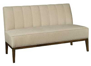
We decided we wanted a piece of  furniture that could be moved from the end of the table to the side--depending on the table orientation and how many were dining.  We wanted a sprung seat, bare legs, durable upholstery that could take a beating, no arms to impede access from the sides, and simple elegant enduring design that would perfectly complement our new kitchen.  Eventually...we found it, the perfect thing: Hickory Chair's Bistro Banquette.


The Bistro Banquette by Mariette Himes Gomez for Hickory chair
Hickory Chair allows you to customize your banquette right down to the size and finish of the upholstery tacks.  We chose a smooth black leather, and dark stain for the legs, very much like the chair version shown below.
The Bistro Chair by Mariette Himes Gomez for Hickory chair
We'd found it, but we also found we couldn't have it for about 12 weeks.  Since the kitchen renovation had taken so many years to come to fruition, we decided several months for the perfect banquette/dining sofa was not too long to wait.

And now, the wait is over: 

Here it is in situ with a lambskin over the seat (luxurious cat claw protection)
When the banquette arrived, it made our much abused Duncan Phyfe dining table (purchased very cheaply via an ad in the Pennysaver, long before the days of Craigslist or Kijiji) look very shabby and out of place with it's medium brown scratched finish.  But the table dimensions were so perfect for our space that we decided to refinish rather than replace it.  I scraped all the peeling veneer from the edge of the table with a razor, sanded the top and the curvy tripod legs, and stained it all with a dark Minwax oil based stain that I mixed to match the legs of the sleek new banquette--so dark that the missing edge veneer is not at all apparent. We we surprised by the effectiveness of the transformation.  I wish I had a picture of its state prior to refinishing. 

Another view without lambskin and refinished Duncan Phyfe table
We now think that the two pieces live quite happily together in the space.  The table gets to stay.  We still need to find chairs.  Right now my wicker-look black resin outdoor IKEA chairs are sitting across from the banquette.  They're quite comfortable, but maybe aren't quite the thing.

Hickory Chair Bistro banquette, Duncan Phyfe table, and IKEA outdoor chairs
But who knows?  It may be sometime before I get around to changing things.

Monday, November 7, 2011

Tile Backsplash Update

Our renovated kitchen has existed in a nearly complete state for several months now, but we're still several details short of proclaiming it fait accompli, so I'm going to post about some of the interim stages before revealing the full thing.

the bar sink corner now grouted
When I left off telling the tale, we were in the process of tiling our backsplash (read about it here).  We did this job ourselves and we're very pleased with the results.  We used now ubiquitous subway tile in an ivory colour, but we think it goes well with our house, which was built in 1889. 
Our looming decision was grout colour.  We wanted one to contrast with the tile enough to show the pattern but not so much as to be distracting. What we really wanted was something like the shadow line cast by the ungrouted tile.  After much debate and vacillation, we chose a slightly cool gray called silver (from the Mapei line of sanded grouts).  Our reasoning was that the cool gray would provide some opposition to the ivory of the tile and prevent the wall looking too warm or muddy.  We think we made a good choice. Looking at it now, the grout is a good match for the shadow line of the inset cupboard door--just what we'd hoped for.

Serendipity was at work for us. The ogee trim tile we had left over from our bathroom renovation was an almost perfect match for the moulding our cabinet maker used for the under cabinet light valance (although we did have to order 8 more pieces from California), and we were able to file down a special little corner piece to finish off the line of ogee tile without having it stand proud of the column.

serendiptious match of ogee tile and light valance moulding

We'd originally thought we would clad over our cement and brick column (read about that epic saga here), but in the end we liked the cement and decided to let it stay and just run the tile all the way up to the ceiling on the other side.  I love how this corner turned out.  Our cabinet maker did a beautiful job of scribing the cabinet to the very uneven wall and, now tiled, the corner looks seamless.

tile to the ceiling at the glass corner cabinet

We decided to forgo any special tile pattern over the range, because we thought it would be largely obscured by the plate rack (our modified IKEA Grundtal rack).  We're thrilled with our hacked IKEA rack.  We're not the first to do this, but really, it couldn't be better.  N cut each stainless steel rod of the disassembled IKEA rack to the correct length (42") with a pipe cutter, popped out the little piece meant to the recive the screw using a dowel and a mallet, and epoxied the little piece back in the newly cut rod ends.  The brackets were mounted in chiseled-out recessed niches in the studs behind the range.  We tiled right over the brackets and now we have the best over range shelf anywhere.  We mounted it high enough for plates to catch the most rays from the heat lamps on the range hood.

behind the range backsplash and tiled-in, cutomized IKEA Grundtal pan/plate rack
What you can't see in the photograph is the line of cigar tile pieces that we put behind the pot rack and which allowed us to configure the layout so that we could end with a full tile under the hood (yet another serendipitous point in our tile layout planning).
Even though we chose a medium colour, and sealed the grout, we do have a bit of staining on the grout above the grill on the range from our daily cooking dramas, but it's really barely noticeable.

another view of the corner cabinet and tiled wall

So ends the tile and grout saga.

Tuesday, November 1, 2011

Not last night but the night before...

forty-two robbers came to my door.  Okay, it was last night.  And they all asked very politely.

pumpkins, washed, and awaiting their fate
The first swarm of 6 little girls were costumed as Dorothy, a bee, and various princesses.
Next came a tiny walking Jack-o-lantern, 
and then two social workers (really) asking for non-perishable food items (they got the best haul of the evening),
followed by a witch with a glowing blue skull on her hat.
Then came not one, but two Freddy Kruegers (they were going to dress as a Teletubby and a nerd-ostrich combo, but couldn't muster the energy or so they said)...

Carving in progress--deadly nightshade and poisonous toadstools
The next loud twist of the doorbell was from a stormtrooper.
Then our across the street neighbours arrived with a new babe in arms all dressed in pink,
followed by a witch and a pirate,
a mad scientist,
a leprechaun (self described as the Lucky Charms guy),
a spy,
a sparkle witch,
tiny Papa Smurf,
a ninja,
an alien,
a clown,
a superhero with an H on his chest (Hyperdrive?)
a glamrock zombie (fantastic costume!)
a witch,
a lamb,
a Scream-masked ghost,
a much bigger smurf,
a vampire...
my out of focus, but favorite, barn owl pumpkin
Then, at 8, there was a lull.
...
Then arrived a panda bear and her very young mom who was also eager for candy, signalling a change in tone.
Next came Super Mario and his teenaged parents,
a marijuana leaf emblazoned flag wearing "green party" member (who liked my magic mushroom pumpkin),
a biker,
a boss bear (sporting a moustache),
a girl (or was it?),
a lingerie model in an overcoat,
and a cowboy (a pimp cowboy explained his friends).
the rechristened magic mushroom pumpkin
And then, like that, they were all gone, bump, into the night.

We survived the onslaught and even have leftover chocolate, mostly of the 70%+ cocoa variety...
as planned.

Regular house-related blog posting to resume shortly.